


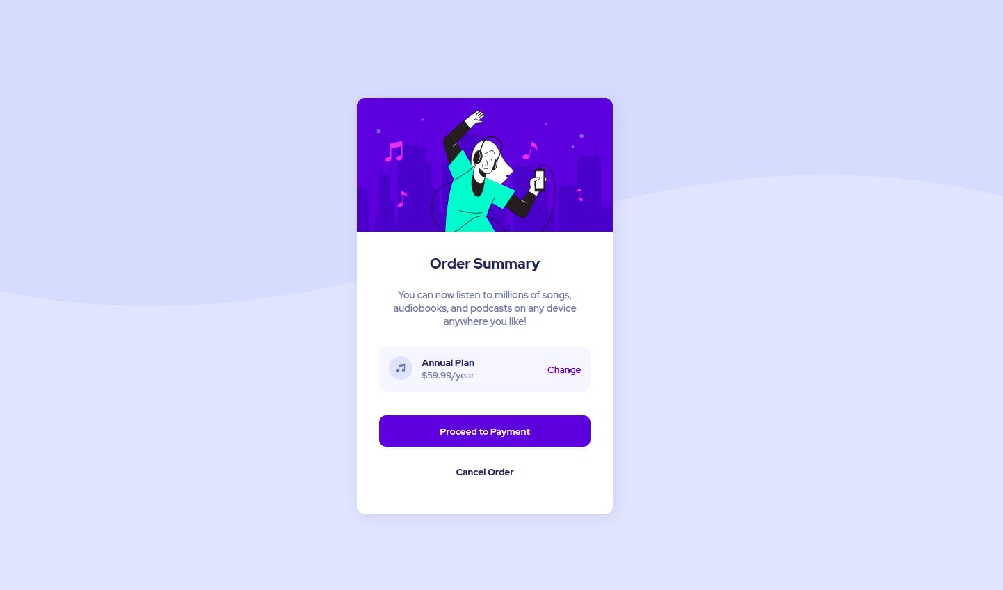
In this tutorial we are going to learn to solve a challenge to build out the order summary card component from Frontend Mentor and make it look as close to the design as possible.
Lets begin by defining the HTML markup
Since it a Frontend Mentor challenge you could download the starter file from this link or you could alternatively copy the following code into your index.html.
<!DOCTYPE html>
<html lang="en">
  <head>
    <meta charset="UTF-8" />
    <meta http-equiv="X-UA-Compatible" content="IE=edge" />
    <meta name="viewport" content="width=device-width, initial-scale=1.0" />
    <title>Document</title>
  </head>

  <style>
    /* style goes here */
  </style>
  <body></body>
</html>
Inside the body tag create a div tag which contains the class name "main"
<body>
   <div class="main">...</div>
</body>
Then we will create another div with the class name "order-card" which will be our card element. The order-card classed div will contain two sections
- First section which contains the card hero illustration
- Second section which contains the entire card content from card title to card buttons that the user could interact with
  <body>
    <div class="main">
      <div class="order-card">
        <div class="img-div">
        <img src="https://res.cloudinary.com/dyvivj6d5/image/upload/v1633008237/illustration-hero_hehadt.svg" alt="" />
        </div>

        <div class="content-div">
          <h2 class="card-title">Order Summary</h2>

          <p class="card-subtitle">
            You can now listen to millions of songs, audiobooks, and podcasts on
            any device anywhere you like!
          </p>

          <div class="plan-div">
            <div class="plan-about">
              <div class="music-icon">
                <img src="https://res.cloudinary.com/dyvivj6d5/image/upload/v1633008286/icon-music_sapdxr.svg" alt="" />
              </div>

              <div>
                <div class="plan-name">Annual Plan</div>

                <div class="plan-price">$59.99/year</div>
              </div>
            </div>

            <div class="change-div">Change</div>
          </div>

          <div class="card-cta">
            <div class="proceed-btn">
              <button>Proceed to Payment</button>
            </div>

            <div class="cancel-btn">
              <button>Cancel Order</button>
            </div>
          </div>
        </div>
      </div>
    </div>
  </body>
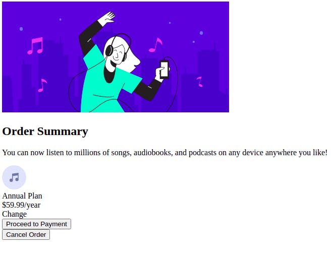
Without the CSS, our page will look like this:
The CSS
First we will import the Red Hat Display google font from https://fonts.google.com/ and then we will use basic CSS reset to make the UI look consistent on all browser.
html {
  margin: 0;
  padding: 0;
  box-sizing: border-box;
}

body {
  margin: 0;
  padding: 0;
  font-size: 16px;
  font-family: "Red Hat Display", sans-serif;
}

button {
  font-family: "Red Hat Display", sans-serif;
  cursor: pointer;
}

img {
  width: 100%;
}
We are setting the default font size of the body content as 16px. Also since the image will be of its original size it is important to set the image width to 100% because that way it will fit inside the div it is inside of.
Styling the card component which has a class named "order-class"
.order-card {
  width: 23em;
  box-shadow: 4px 4px 25px rgb(0 0 0 / 7%);
  border-radius: 12px;
  overflow: hidden;
}

.img-div {
  height: 12em;
}

.img-div img {
  height: 100%;
}

.content-div {
  text-align: center;
  padding: 2em;
  background-color: white;
}

.card-title {
  margin: initial;
  font-size: 1.3em;
  color: hsl(223, 47%, 23%);
}

.card-subtitle {
  margin: 1.5em 0;
  font-size: 0.9em;
  color: hsl(224, 23%, 55%);
}

.plan-div {
  display: flex;
  justify-content: space-between;
  align-items: center;
  background: hsl(225, 100%, 98%);
  margin: 2em 0;
  padding: 1em;
  border-radius: 10px;
  font-size: 0.85em;
}

.plan-about {
  display: flex;
}

.music-icon img {
  width: 2.5em;
  margin-right: 1em;
}

.plan-name {
  color: hsl(223, 47%, 23%);
  font-weight: bold;
  font-size: 1em;
}

.plan-price {
  font-size: 1em;
  color: hsl(224, 23%, 55%);
}

.change-div {
  color: hsl(245, 75%, 52%);
  text-decoration: underline;
  cursor: pointer;
}

.change-div:hover {
  text-decoration: none;
}

.proceed-btn button {
  color: white;
  font-weight: bold;
  border: none;
  background: hsl(245, 75%, 52%);
  padding: 1em;
  width: 100%;
  margin: 0.5em 0;
  border-radius: 10px;
  box-shadow: 0 8px 6px -6px rgb(0 0 0 / 7%);
}

.cancel-btn button {
  color: hsl(223, 47%, 23%);
  font-weight: bold;
  border: none;
  background: transparent;
  padding: 1em;
  width: 100%;
  margin: 0.5em 0;
  border-radius: 10px;
}
This will make everything look better.
How to make the background look similar as well
.main {
  height: 100vh;
  display: flex;
  justify-content: center;
  align-items: center;
  background-image: url(https://res.cloudinary.com/dyvivj6d5/image/upload/v1633008330/pattern-background-desktop_rx38qw.svg);
  background-repeat: no-repeat;
  background-size: 100% 50%;
  background-color: hsl(225, 100%, 94%);
}
Target the .main class which acts as the parent div of the card component. Setting the height of an element to 100vh means that the element will have a width that’s 100% of the viewport size.
Then will use flexbox layout to make our card center aligned both horizontally and vertically.
And finally we will use background-image property to set the background image to an curved svg vector graphics and will use the background color - pale blue to blend with the background image
Final Code
HTML Markup
<!DOCTYPE html>
<html lang="en">
  <head>
    <meta charset="UTF-8" />
    <meta name="viewport" content="width=device-width, initial-scale=1.0" />

    <title>Frontend Mentor | Order summary card</title>

  </head>
  <body>
    <div class="main">
      <div class="order-card">
        <div class="img-div">
          <img
            src="https://res.cloudinary.com/dyvivj6d5/image/upload/v1633008237/illustration-hero_hehadt.svg"
            alt=""
          />
        </div>

        <div class="content-div">
          <h2 class="card-title">Order Summary</h2>

          <p class="card-subtitle">
            You can now listen to millions of songs, audiobooks, and podcasts on
            any device anywhere you like!
          </p>

          <div class="plan-div">
            <div class="plan-about">
              <div class="music-icon">
                <img
                  src="https://res.cloudinary.com/dyvivj6d5/image/upload/v1633008286/icon-music_sapdxr.svg"
                  alt=""
                />
              </div>

              <div>
                <div class="plan-name">Annual Plan</div>

                <div class="plan-price">$59.99/year</div>
              </div>
            </div>

            <div class="change-div">Change</div>
          </div>

          <div class="card-cta">
            <div class="proceed-btn">
              <button>Proceed to Payment</button>
            </div>

            <div class="cancel-btn">
              <button>Cancel Order</button>
            </div>
          </div>
        </div>
      </div>
    </div>
  </body>
</html>
CSS Styles
@import url("https://fonts.googleapis.com/css2?family=Red+Hat+Display:wght@500;700;900&display=swap");

html {
  margin: 0;
  padding: 0;
  box-sizing: border-box;
}

body {
  margin: 0;
  padding: 0;
  font-size: 16px;
  font-family: "Red Hat Display", sans-serif;
}

button {
  font-family: "Red Hat Display", sans-serif;
  cursor: pointer;
}

img {
  width: 100%;
}

.main {
  height: 100vh;
  display: flex;
  justify-content: center;
  align-items: center;
  background-image: url(https://res.cloudinary.com/dyvivj6d5/image/upload/v1633008330/pattern-background-desktop_rx38qw.svg);
  background-repeat: no-repeat;
  background-size: 100% 50%;
  background-color: hsl(225, 100%, 94%);
}

.order-card {
  width: 23em;
  box-shadow: 4px 4px 25px rgb(0 0 0 / 7%);
  border-radius: 12px;
  overflow: hidden;
}

.img-div {
  height: 12em;
}

.img-div img {
  height: 100%;
}

.content-div {
  text-align: center;
  padding: 2em;
  background-color: white;
}

.card-title {
  margin: initial;
  font-size: 1.3em;
  color: hsl(223, 47%, 23%);
}

.card-subtitle {
  margin: 1.5em 0;
  font-size: 0.9em;
  color: hsl(224, 23%, 55%);
}

.plan-div {
  display: flex;
  justify-content: space-between;
  align-items: center;
  background: hsl(225, 100%, 98%);
  margin: 2em 0;
  padding: 1em;
  border-radius: 10px;
  font-size: 0.85em;
}

.plan-about {
  display: flex;
}

.music-icon img {
  width: 2.5em;
  margin-right: 1em;
}

.plan-name {
  color: hsl(223, 47%, 23%);
  font-weight: bold;
  font-size: 1em;
}

.plan-price {
  font-size: 1em;
  color: hsl(224, 23%, 55%);
}

.change-div {
  color: hsl(245, 75%, 52%);
  text-decoration: underline;
  cursor: pointer;
}

.change-div:hover {
  text-decoration: none;
}

.proceed-btn button {
  color: white;
  font-weight: bold;
  border: none;
  background: hsl(245, 75%, 52%);
  padding: 1em;
  width: 100%;
  margin: 0.5em 0;
  border-radius: 10px;
  box-shadow: 0 8px 6px -6px rgb(0 0 0 / 7%);
}

.cancel-btn button {
  color: hsl(223, 47%, 23%);
  font-weight: bold;
  border: none;
  background: transparent;
  padding: 1em;
  width: 100%;
  margin: 0.5em 0;
  border-radius: 10px;
}
Thank you and hope this article was helpful. :)